
Writing Proposals That Win Design Projects
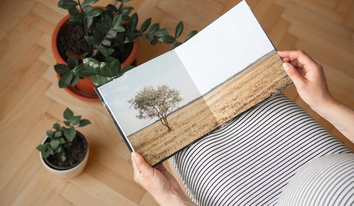
Why Most Brochures End Up in the Bin
Every brochure you design is competing with a recycling bin. That sounds bleak, but it is a useful starting point. The ones that survive are not always the most beautiful — they are the ones that still have a job to do after the first read. A price list, a map, a checklist, a timetable, a set of measurements: anything the reader might need next week is a reason to keep the thing on a desk rather than in the bin.
So before you open a layout, ask a simple question: what would make someone keep this? If you cannot answer it, neither can your client's audience.
Plan the Structure Around the Reader's Journey
Fold a sheet of A4 in half and you get four panels, not four pages. Thinking in spreads rather than pages is one of the quickest ways to make a brochure feel considered, because it forces you to decide what sits side by side.
- Cover: one clear promise. Resist the urge to cram the full services list here.
- Inside front: the strongest reason to read on — a benefit, a bold number, a question.
- Middle spreads: one idea per spread. If a spread needs a caption to explain it, it is doing too much.
- Inside back: the practical material — prices, sizes, opening hours, a map.
- Back cover: contact details, plus something useful such as a diary page or a checklist.
Sketch this on paper before you go near a screen. Ten minutes with a pencil saves hours of rearranging artboards.
Choose Paper That Suits the Job
Paper does more for perceived quality than almost any other decision, and it is the one clients most often leave to the last minute. A few rules of thumb:
- Cover stock: 250–350gsm. Anything lighter feels like a leaflet rather than a brochure.
- Inner pages: 120–170gsm. Below 120gsm, show-through becomes a real problem once images are involved.
- Uncoated: warm, tactile and easy to write on. Ideal for anything the reader might annotate.
- Silk: a good middle ground, with accurate colour reproduction and a soft finish.
- Gloss: punchy images, but fingerprints show and it can feel dated.
Check the total weight against postal limits before you commit, and ask your printer for a blank dummy. Holding a folded mock-up will tell you more about the fold, the feel and the opening than any spec sheet ever will.
Typography That Earns a Second Read
Restraint pays. Two typefaces — one for headings, one for body text — is plenty for most brochures, and a single well-chosen family with a range of weights is often stronger still.
- Body text at 9–11pt with generous leading, usually 1.3–1.5 times the type size.
- Line lengths of roughly 60–75 characters. Longer lines tire the eye; shorter ones break the rhythm.
- Never set small type in reverse over a busy photograph. If you must reverse it, place it on a solid or heavily darkened area.
- Keep a clear hierarchy: one heading size, one subheading size, one body size — and stick to it throughout.
Print at 100% on plain paper before you send anything to press. Small type that looks perfectly legible at 300% on screen is often unreadable in the hand.
Give the Reader Something to Use
The difference between a brochure that is read once and one that is kept for months is usually utility. A few ideas that clients rarely think of but always appreciate:
- A planning page, calendar or seasonal checklist.
- A comparison table so readers can weigh up options themselves.
- A tear-off card, or a page designed to be pinned to a noticeboard.
- Clear, accurate contact details set at a size people can actually read.
- A short glossary if the subject matter is technical.
Utility does not make a design dull. It gives the layout a reason to exist, and it gives the reader a reason to come back to it.
Getting It Print-Ready Without Tears
Most disappointments come from a handful of avoidable details. Build 3mm bleed and a safe margin into your document from the start. Work in CMYK and check that any rich blacks are set deliberately rather than by accident. Embed or outline your fonts, and supply images at 300dpi at their final placed size.
Always request a proof, and a wet proof for anything where colour accuracy matters. If the budget stretches, ask for a single printed copy before the full run — it is far cheaper than reprinting.
Finally, have the conversation with your client early about who is writing the copy, who is proofreading it and who signs off the final version. A beautifully designed brochure with three typos is not a keeper, and no amount of good paper will save it.
LEAVE A COMMENT